Tennis Ball Magazine Article


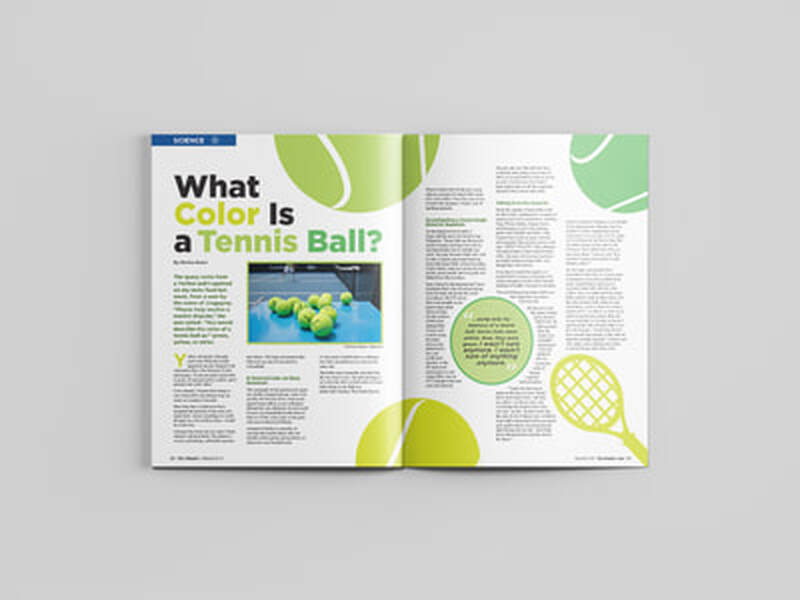
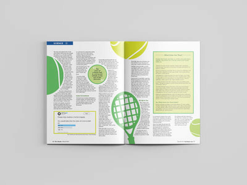
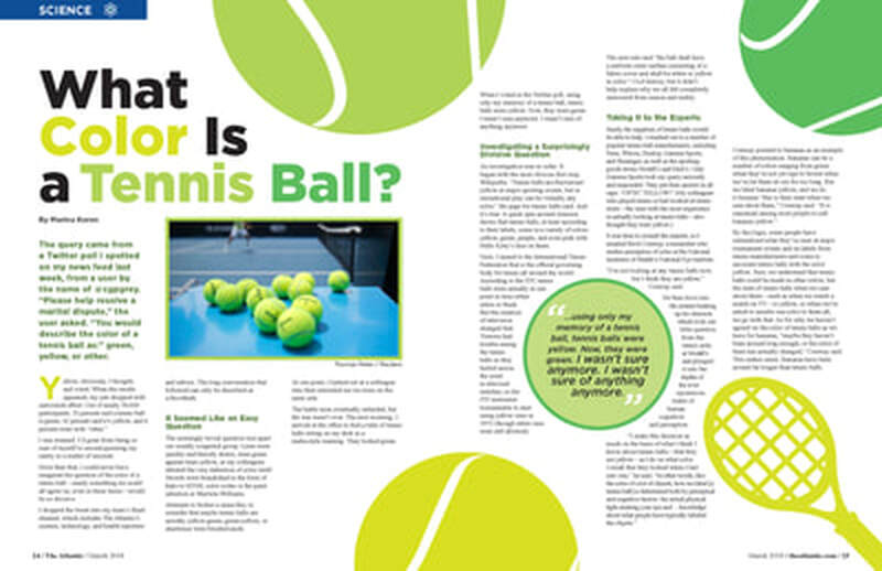
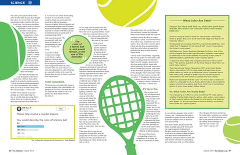
For this project, I had to choose a magazine article from online to design a 4 page (2 spread) for. I chose this article about tennis balls because it seemed fun and the concept of the color of one was what allowed me to come up with my design. I decided on 3 colors that a tennis ball could be based off the article and then applied those 3 colors to the elements of my pages. I used a vector image of a tennis ball and tennis racket which I then recolored in Illustrator to my 3 colors. I also created the icon for the science category in Illustrator.
I designed my pages to have the tennis balls and rackets to break up the information in a fun way that made the article look easy to read and not just a bunch of intimidating text. I thought of using just boxes for my pull quotes, but decided to make shaped like tennis balls to fit the theme of the article more. I initially wanted to left justify all of my text but ran into issues with the text wrapping around the other elements and decided to leave the text ragged which works better with the text wrapping as well as looks more like a magazine article to me.
I designed my pages to have the tennis balls and rackets to break up the information in a fun way that made the article look easy to read and not just a bunch of intimidating text. I thought of using just boxes for my pull quotes, but decided to make shaped like tennis balls to fit the theme of the article more. I initially wanted to left justify all of my text but ran into issues with the text wrapping around the other elements and decided to leave the text ragged which works better with the text wrapping as well as looks more like a magazine article to me.